ReviveHealth
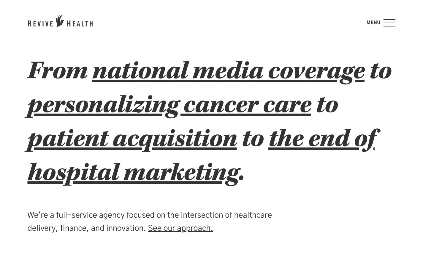
When I first came onboard, ReviveHealth was primarily a PR firm that had a small but growing digital & creative team. Fast forward two years later, and the agency was well on its way to becoming full-integrated — covering strategy, analytics, and execution — and had more than doubled in size. It soon became clear that our old website (which launched in early 2016) longer capable of representing the kind of agency we becoming. It was time to refresh.
UX Strategy & Planning
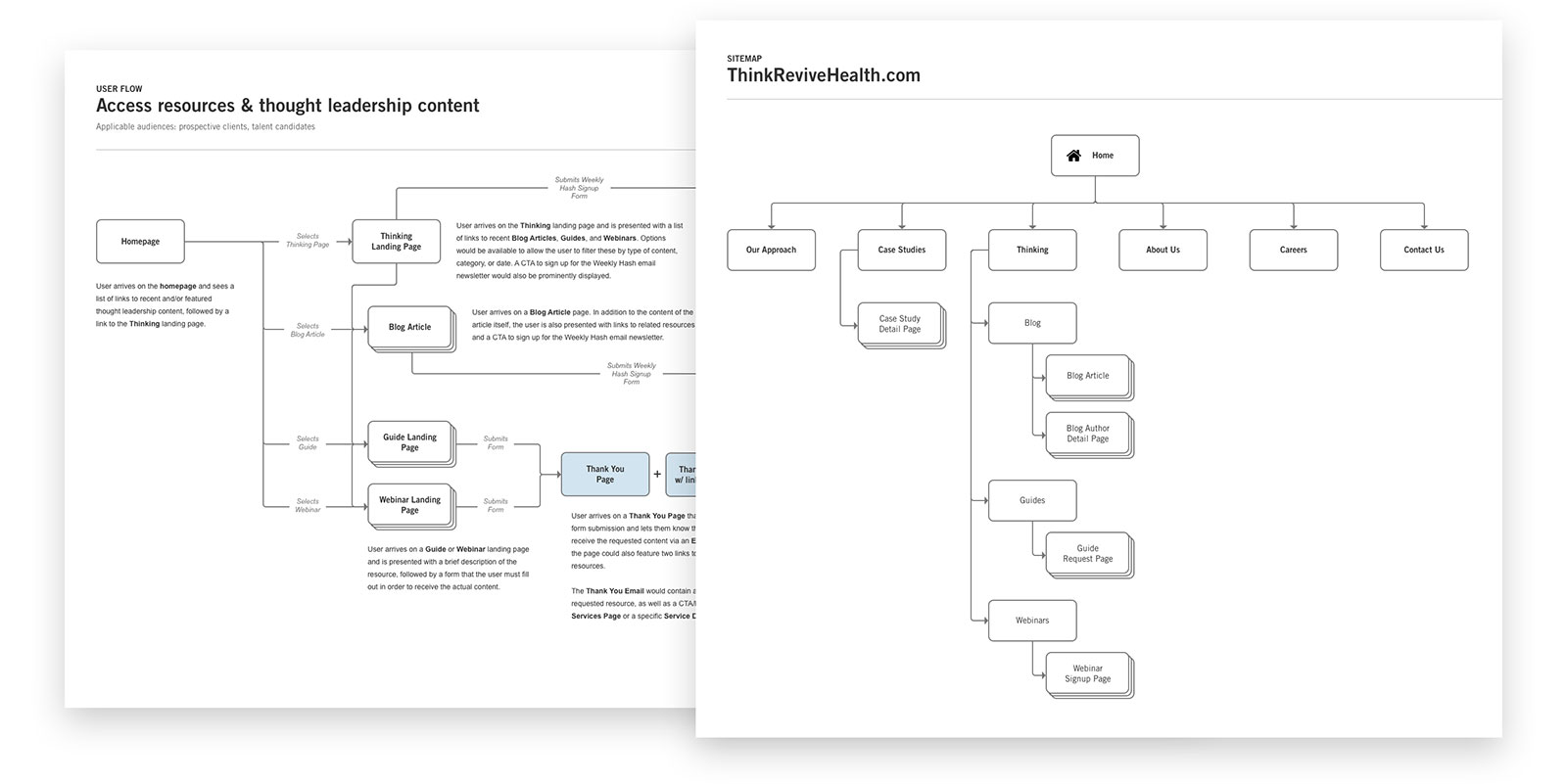
Beginning with a brief drafted by our internal marketing team, we identified our target user audiences and outlined the goals that each audience would be looking accomplish on the site. We then further broke these down into discrete tasks, and I designed detailed user flows to account for each step our users would take on their journey to complete each task. These in turn gave us the building blocks for our information architecture and sitemap.
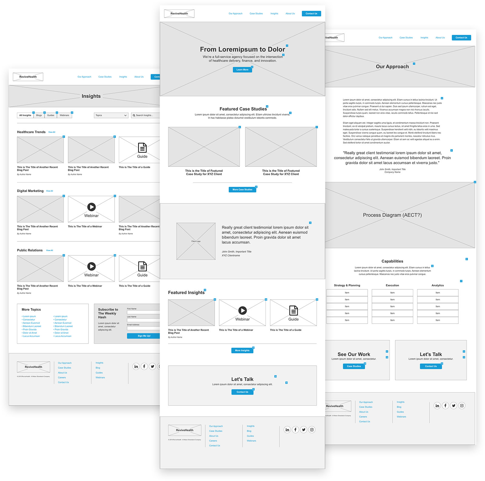
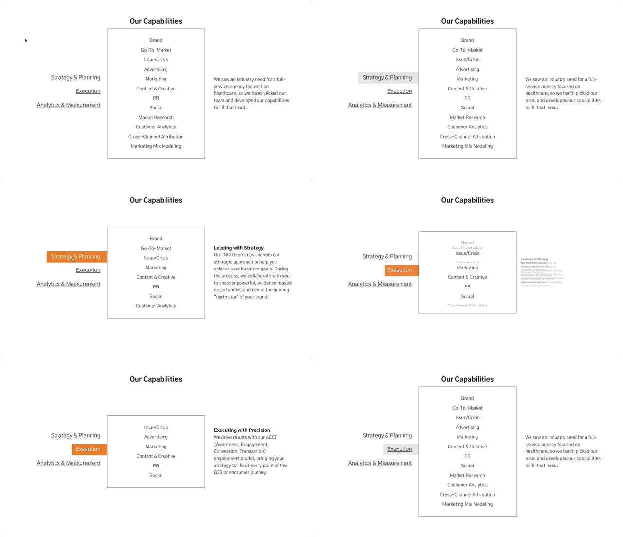
Next, I designed clickable wireframes that outlined in detail the content, components, and flow for each page.
Design
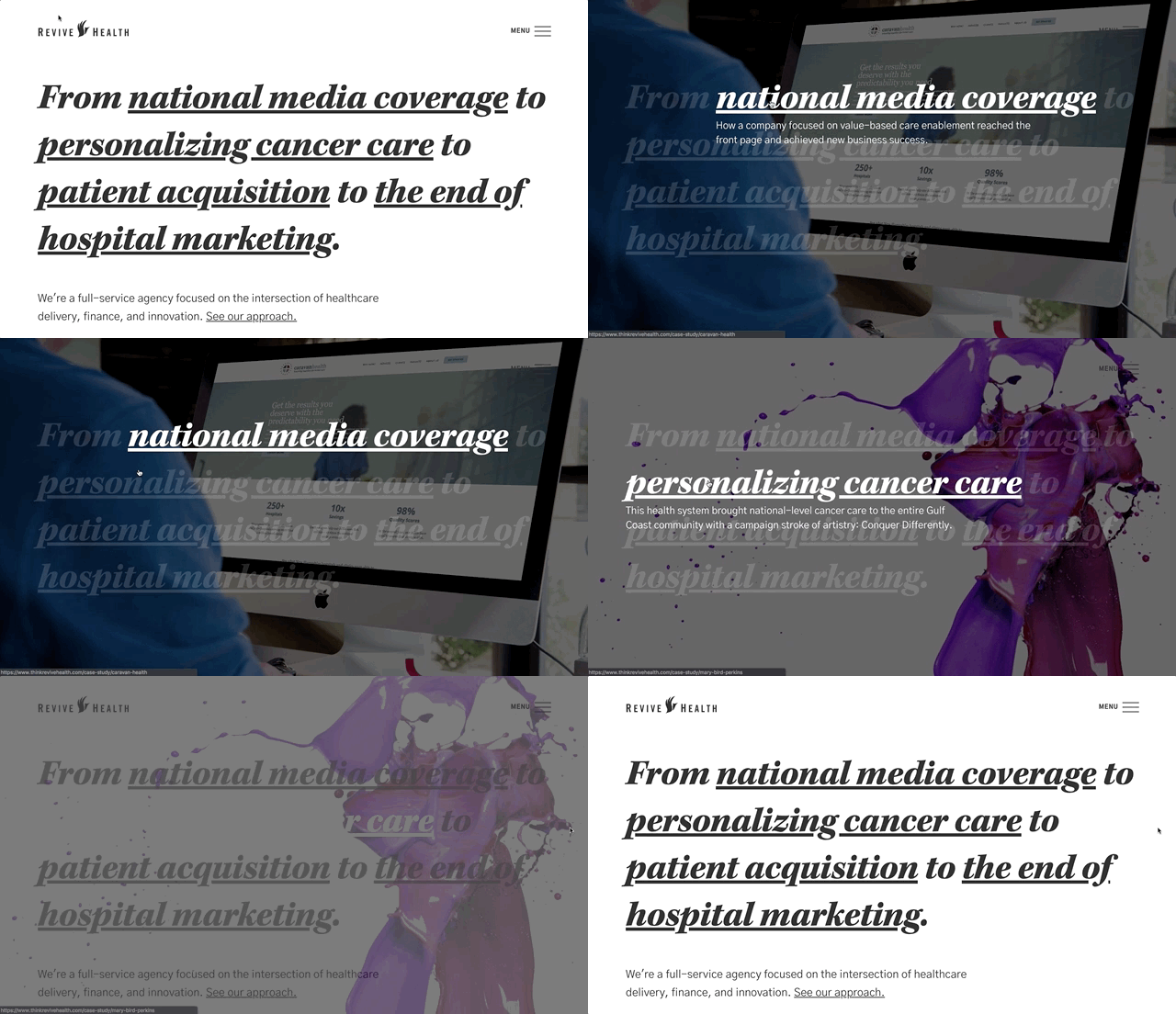
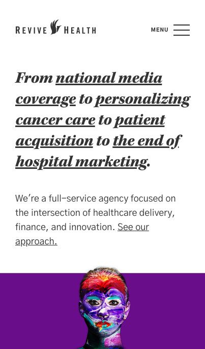
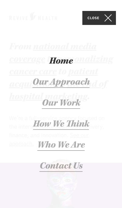
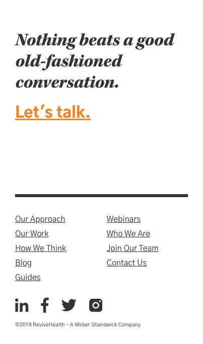
We knew we wanted the design to feel edgy and different, but at the same time sophisticated and professional. After a few rounds of concepting, I finally hit upon a look that felt just right for what we were going for: bold, spartan, and brazenly typography-driven. The unusual interactive home page feature, featuring full-screen background images that appear on-hover, sealed the deal.

Augie Phillips, Senior Marketing Specialist at ReviveHealth”Working with Michael feels like working with an entire agency wrapped up into one human. He's considerate of business goals alongside user priorities, has such a wealth of knowledge that bridges design & development, and is willing to find value in the absurd (which, I believe, might actually be my love language). The projects we get to collaborate on are some of my favorite pieces of work at Revive, and I'm excited about the work that's still to come.“